'Add Input Validations' page

In this page you can attach validations to the fields. The validations are meant to prevent your visitors from entering invalid or inconsistent data.


The layout of the page

The left side box shows the form shows the input fields and the validations in a tree structure.

Select the input element from the left side box and you can select the validations on the right side.
The validations that appear to the right side depend on the type of the element that you select on the left side.


Editing the properties of the validation

Validation options

Select a validation node from the left side. The right side shows the properties of the validation.


Error String
This field contains the error displayed to your visitor when the validation fails.

See: How to edit the validation error messages


Conditional Validation
If you want to conduct the validation only under some conditions, then you can use the conditional validation feature.  Click on the 'validate only on the following condition' check box Then click on the Condition button to open the Validation condition dialogbox

 
In the 'validation condition; dialog box, you can select the condition when the validation needs to be enabled


See: How to add a conditional validation
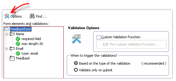
 

Validation Options

validation-options

Press the options button to edit the general validation options.


Custom Validation Function
If the built-in validations do not meet your requirement, you can custom-code the validation in the custom validation function.


The custom validation function has a single parameter: the form object.

If you have more than one validations, then you can ladder all those conditions in the same custom validation function.


If the validation fails, the function should return an object containing the element and the error message like this:

 
if(failed)
{
return ({ elementobj:formobj.elements['userid'], message:'user ID not found!' });
}


See: How to add your own validations


When to trigger the validations
You can conduct the input validations based on the type of the validations or when the visitor submits the form. In the first method, the validation is triggered based on the type of the validation. For example, the numeric validation is triggered as the user types the value (so that the user gets immediate feedback). Similarly, email validation is done when the user switches the focus. This method focuses on giving the least intrusive feedback as early as possible.

In the second case (validation on submit), the validation done only when the form is submitted.

Please note that in the first method, the form submission also triggers all the validations. It makes sure that form is submitted only after the validations.


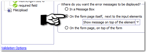
How do you want to display the error messages
You can have the error messages displayed in a message box or have the error messages displayed in the form page itself. The error message can be displayed in a floating error box or in a single box on the top of the form.


Floating error box style

validation-errorbox-style-float

 
Selecting the type of error message display


Floating error box in the browser

Floating error box shown in the browser


Single error box on the top of the form
Select the 'On the form page, on top of the form' to display the error messages on top of the form.
 

Single box error

Single box error shown in the browser 


See Also:

Smart Validations


Unique validation requires Database